Evaluating the adequacy of warnings
Help in identifying when and why a product warning is inadequate
In lawsuits where a client has been injured while using some product or device, it is common to question whether he or she was properly warned so as to avoid the injury. While the plaintiff’s attorney might have an intuitive, “know-one-when-I-see-one” feeling for good or bad warnings, intuition is not the strongest ammunition in court. It would be helpful if the attorney had a concrete checklist of well-accepted warnings criteria against which to compare the instant situation before deciding whether to challenge the warning and enlist a warnings expert.
As an expert witness in the area of communication, about half my cases have involved opinions about the adequacy of warnings. Over the course of the first dozen or so of these, a checklist of a priori criteria for evaluating warnings began to evolve. I will share my checklist in this article. My purpose is to help trial lawyers appraise their intuition about warnings and determine when it is worthwhile to challenge the adequacy of a warning.
There are eight criteria I consider to be mandatory in virtually all cases. While the list of eight is my own, individually they all are endorsed via warnings-research literature. I will describe each criterion briefly and will exemplify with actual warnings from cases I have worked on.
- Does the warning include all necessary information?
Often it is not good enough for a warning to say, “Danger: Don’t . . . ,” or “Warning: Always . . . .” An adequate warning must give all non-obvious information as to what constitutes safe or dangerous use. For example, my first case involved a fellow doing pull-ups with a “Door-Bar Gym” – a chin-up bar with suction cups at the ends of two sections that can be telescoped outward for a tight fit in a doorway. While the consumer was doing pull-ups with his legs tucked, the bar slipped and both kneecaps fractured when they hit the marble floor below.
There was a clear statement on the box that the bar was “Capable of holding up to 200 pounds when properly secured to doorframe.” In effect, this is a warning both that the device is not safe for those weighing more than 200 pounds (he weighed much less), and a warning that it needs to be properly secured. The defense stated that “properly secured” meant to screw the enclosed brackets into the doorframe (which plaintiff had not done). The plaintiff assumed that “properly secured” meant having tightly-telescoped suction cups and that the brackets were for people over 200 pounds. If the bar is only safe when used with brackets screwed into the doorframe, then the warning did not contain all necessary information. It should have said something like, “Capable of holding up to 200 pounds when secured to doorframe with enclosed brackets.”
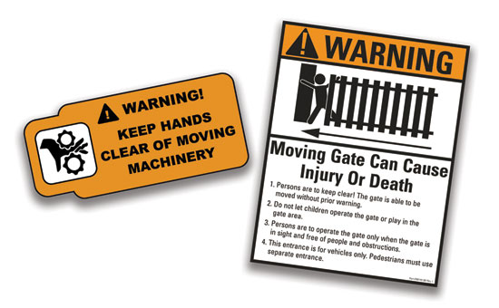
As a second example, consider a motorized gate for the vehicle entry into a neighborhood. An eight-year-old boy was crushed and killed by the gate. The gate bore a warning placard that read: “Warning: For safe operation, test gate mechanism monthly.” Not bad. But if defense wants to argue (as it did) that the accident wouldn’t have happened if only the monthly testing had been performed, then there needs to be instructions on how to conduct a valid test. Information on how to conduct this purportedly vital monthly test was nowhere to be found, however – not on the warning signs, not in the operator’s manual, nowhere!
- Is the warning presented so as to be noticed?
While we can debate whether the proverbial tree falling in the vacated forest makes a sound, recognized communication scholars are in 100 percent agreement that if a warning (or any other kind of message) is not received, there is no communication. And if there is no communication, there is no warning.
A warning will be ineffective if it is presented in such a way that the eventual user misses it entirely. The greater the likelihood of being missed, the less the quality of the warning, so presentation is very important.
I see very bad presentations often – warnings on the bottom of the box, warnings on one end of a box but not necessarily the end that will be opened, warnings in such tiny print that they cannot be read without a magnifying glass, and so on. And there are excellent presentations. For example, warnings can be attached to the package or box with a zip-tie or some such item so that the box cannot be opened without removing and presumably noticing the warning. Better yet, perhaps, sometimes warnings can be attached to the product such that the product literally cannot be used without first removing and presumably noticing the warning (for example, a warning attached to a wire blocking the trigger of a new electric saw).
Improved presentation of warnings usually does not have to require extra time or expense. Sometimes it is simply a matter of using a larger type size, or placement on both ends of the box, or highlighting via a different color, or adding an icon. The main thing it requires is that placement be taken seriously and be given a little forethought.
- Is the warning clear and unambiguous?
Sometimes accidents happen because a warning can be interpreted more than one way and the victim chooses the wrong one. For example, the bottle of fuel for a decorative fireplace contained the warning, “Danger: Can be explosive if not handled correctly.” Without further explanation (which was not provided), “handled correctly” is unclear. The accident victim thought it referred to proper storage since storage instructions were included elsewhere on the label. The defense claimed it referred to keeping vapors away from open flames.
In a different location on the same bottle, there were admonitions not to pour fuel “onto hot surfaces,” and not to “fill a hot fireplace.” But how hot is hot, and how do we test for it? Much better would be, “Before fueling, make sure all surfaces are cool to the touch,” or “ Wait at least 10 minutes after flame is extinguished before refueling fireplace,” or something similar.
As a simpler example, consider a carton for a trailer-hitch ball that says, among many other things, simply, “3500 lbs. GVWR.” I doubt that the average consumer knows what GVWR is (gross vehicle weight rating). Compare that to competitors’ packaging: “5000 lb. maximum tow rating,” “6000 lb. towing capacity,” “Up to 6000 lbs. Gross Trailer Wt.,” and so forth.
There is a general communication principle that we should never unintentionally allow our receiver to wonder, “What the heck did he or she mean by that?” This is especially important where we are instructing how to avoid serious harm. A vague or ambiguous warning is an inadequate warning.
- Does the warning include a signal word and acknowledge potential injury?
Headings such as, “Danger!” or “Warning!” are called signal words, and there is empirical evidence that they improve the effectiveness of warnings. Ideally, the signal word is followed by an acknowledgement of the potential for injury. Sometimes this is in the form of a pictograph or icon depicting the nature of the danger. Other times, it is a verbal message to the effect that, “Failure to heed this warning can result in serious injury or death.” We see this so often that it may be surprising when I say that in over half of the warnings cases I have worked on, this standard warning was completely absent, even though serious injury was possible – and indeed did occur, thus the lawsuit. Often it is not good enough to just have the signal word as a heading for correct-use instructions. The “serious injury or death” clause, when true, is very important because people are more likely to read the warning when that clause is present.
A warning is less effective if the audience cannot determine the reason for the admonition. If the reader of a warning has to ask him- or herself, “Why am I not supposed to do that?” then the warning is inadequate. Sometimes this is obvious (e.g., “Shallow. Do Not Dive). Other times it is not. Where true, the serious injury or death clause, though nonspecific, gives an answer to the “why” question.
- Are superfluous warnings avoided?
It is important that warnings be credible. If the receiver of a warning does not believe it needs to be taken seriously, then he or she is less likely to behave according to the warning’s admonition. One thing that can reduce the credibility of a legitimate warning is for it to be accompanied by irrelevant or superfluous warnings. If the receiver considers a portion of the warning to be silly and irrelevant, he or she is more inclined to dismiss remaining portions of the warning.
As an example, the box for the trailer-hitch ball mentioned earlier contained a list of five warnings that began with, “1. Always wear ANSI approved safety goggles when installing this product.” Since there is simply no apparently sensible reason for this warning, it might well allow the reader to take the remainder of the list less seriously, or even to skip reading it altogether.
A similar example comes from a warning decal on the dashboard of a three-wheel golf-cart-type vehicle used by parking-meter officers. The decal instructed, among several other things, “Avoid sudden starts and stops.” Since it is impossible to think of a reason that sudden starts and stops could be dangerous in a low-powered vehicle like this one, this apparently nonsensical warning calls into question the legitimacy of the others on the list. (Of course, if indeed there is a good safety reason to wear goggles when screwing a nut onto a bolt, or to avoid sudden starts and stops in a quasi golf cart, then the warning should stay. But in that case it definitely needs to be accompanied by an explanation so as to legitimize it.)
- Are multiple warnings sequenced properly?
When multiple warnings apply to a product, it is usually best to list them all in one place. There are more effective and less effective ways to sequence that list. The list should be ordered with two separate variables applied simultaneously. It should begin with the least intuitively obvious warning(s) and end with the most intuitively obvious. At the same time, it should begin with the warnings concerned with the greatest risk of serious injury and end with the ones concerning less likelihood of serious injury. Granted, this is subjective, and the combining of two different variables ends up with a judgment call. But there should be an effort to follow the principle and at least not do the opposite. People are more likely to read an entire list of warnings when the first item on the list elicits a response of, “Wow, I wouldn’t have known that. I’m glad I saw it,” not, “Ho-hum, you’re wasting my time.”
The parking-meter vehicle mentioned earlier listed nine warnings on a dashboard decal. The list began with, “Remain seated. Use both hands for steering. Keep arms and legs within vehicle body . . . .” These are hardly the most important warnings, nor are they the least intuitively obvious. A parking-meter officer driving the vehicle swerved hard to avoid a truck that pulled in front of her, her no-doors vehicle began to tilt to the side, she fell out as it was tipping over; it landed on her and killed her. A warning against hard turns is arguably more important than those that began the list. It finally shows up on the list, but it is easy to imagine a driver failing to read that far since the list starts off with obvious warnings of the type we encounter for children’s amusement park rides.
- Does the warning avoid contradictions?
When contradictory warnings occur together, the receiver is forced to guess which one should take priority. And if he or she guesses wrong, the consequences can be disastrous.
Staying with the parking-meter vehicle for a moment, remember that the officer swerved, tilted, fell out, and was killed. The list did contain a warning against swerving hard: “Sudden hard turns can cause upset.” (Yes, that seems a strange way to say it; more on that later.) But it also contained the warning criticized earlier as superfluous: “Avoid sudden . . . stops.” Now, imagine the emergency situation: A truck pulls in front of her. She has been instructed to not swerve hard. But she has also been instructed to not hit the brakes! What other choice is there? (Hitting the truck and letting the seat belt save her from injury was not an option; there was no seat belt.)
Granted, I don’t necessarily believe that in her instant of reaction she consciously reviewed the warnings, tried to unscramble the contradiction, and took a 50/50 chance that swerving was better than hitting the brakes. She probably both swerved and hit the brakes; I don’t know. But whoever put both of those instructions within the same list of warnings wasn’t thinking it through.
Similarly, “Keep arms . . . within vehicle body” seems contradictory in a vehicle designed for people whose job is to reach out the door opening to mark car tires. The warning is bound to be ignored, and since it is not credible, it risks reducing the credibility of the other warnings.’
As another example, recall the Door-Bar Gym defense claiming that the device was supposed to be used only by screwing brackets into the doorframe. This is contradicted, it seems to me, when the box says in big print, “Portable and convenient for use at home or office.” Most people probably are not going to consider a pull-up bar to be “portable and convenient” if screws and brackets have to be removed and reinstalled elsewhere when it is relocated. So this contradiction allows the user to conclude that the brackets are an optional extra feature, not a necessity as claimed by the defense.
- Did the warning use graphics effectively?
Not all warnings require graphics (photos, pictographs, icons), although there is evidence that they can get attention and can communicate well in many circumstances. If graphics are used, it is important that they be clear and consistent. For example, the box for the Door-Bar Gym featured a photograph of a fellow doing pull-ups in a doorway with no brackets whatsoever being used!
A warning sign on the motorized swing gate mentioned earlier, in an ostensible effort to comply with UL requirements to show someone being injured by the gate, had a pictograph of a person being hit by a strange looking form that absolutely no one I interviewed could identify as a gate. (The typical answer was along the lines of, “I have no idea what that thing is supposed to be.”)
In a case where a hunter went deaf after using extremely expensive digital ear protectors that promised “maximum possible protection,” the defense cited small print suggesting obliquely that maximum protection meant using the product along with additional ear-muff-type ear protection. But in none of the two dozen photos in the advertising brochures were any of the hunters or shooters wearing ear-muff protectors.
The trailer-hitch-ball packaging included no graphics, although it would have been simple and almost certainly effective to have included graphic warnings to ensure that the shaft threads extend beyond the nut, or to not use a strap on the ball; both being vital warnings according to engineers on both sides.
These examples have little in common with one another except to represent that although graphics can be helpful, they also can be used badly. Not all warnings have graphics and that is sometimes acceptable. But warnings designers should consider whether and how nonverbal warnings or portions of warnings can be presented most effectively.
Additional considerations
Are these “all or nothing” criteria? To evaluate a warning as inadequate, or ineffective, or poorly done, it is not necessary that it fail on all eight criteria. About the only time this happens is when warnings are completely absent (which, unfortunately, is not uncommon). Most warnings I have examined will “pass” on one or two criteria but fail miserably on a few others. But in many cases failure on only one or two of these criteria is enough to render the warning as ineffective or inadequate. If it is so ambiguous as to imply one thing when it means another, or when it is very likely to not be read at all because of its placement, or when the reader stops reading down to the crucial warning because it is buried in a list that begins with irrelevant or ridiculously obvious warnings, and so forth, that alone can render the warning inadequate. (Most of the warnings I deem to be inadequate violate between three and six of these criteria.)
Do warnings even work?
Of course, if warnings don’t actually work, then all of this is moot. And it is a favorite challenge of defense attorneys to assert that warnings don’t even work, so it wouldn’t have made any difference to this accident if the warning had been improved. For many years, there were scholars claiming that warnings don’t work and there were other scholars claiming that they do work. It is generally accepted these days that this debate has finally been settled. A study led by University of Texas-Austin psychologists performed a statistical analysis of all available empirical tests of the question. A major conclusion of the study was the incontrovertible finding that warnings do increase safe behavior. Because of the comprehensive and sophisticated nature of the study, that conclusion is considered these days to be the final word on the issue. (See, Eli Cox III, Michael Wogalter, Sara Stokes, Elizabeth Tipton Murff (1997). Do Product Warnings Increase Safe Behavior? 16(2) Journal of Public Policy and Marketing, 195-204.)
Empirical support
In cases where a warning has been evaluated as inadequate, either by you as an attorney or by a warnings expert you hire, it is worth considering whether it is worthwhile to confirm the evaluation via empirical testing. An opinion that a warning is ineffective is, in effect, merely a hypothesis, even if the evaluation is derived by applying accepted criteria. Often it is fairly simple to test that hypothesis by asking a sample of people about their likely behaviors upon reading the original warning, then asking about their likely behaviors upon reading presumably improved versions of the warning, and then seeing whether the revisions actually improved effectiveness as predicted.
There is a risk of being found to be wrong, of course, and this would have to be acknowledged under oath. But if the test is performed by an expert witness with experience in social-science research, and on a blatantly poor warning, it is not likely to backfire. (I have never had it happen nor seen it happen.) And the scientific “proof” of the relative inadequacy of the original warning can be very powerful in court. I have discussed scientific testing of expert opinion at length elsewhere. (M. Motley Expert Opinions as Empirically Testable Hypotheses, Forensic Communication: Applications of Communication Research to Issues of Courtroom Litigation. (Hampton Press 2012).)
I am not suggesting that it is the plaintiff’s responsibility to test the warning, of course. That testing should be the responsibility of whomever composed or ordered the original warning. It is hardly ever performed, however.
Did they really try?
Finally, it is worthwhile to ask whether the existing warning appears to represent a sincere effort to ensure that no one is hurt by the product. Although it is difficult to know another’s intentions for certain, often it is fairly obvious that the warning was placed merely to satisfy the legal obligation to provide a warning, and was never intended as a sincere communication effort to protect the user from harm. For apparently inadequate warnings, we can ask hypothetically, “If someone were assigned to compose a warning, and if that person really, truly wanted to make very certain that no one gets hurt, then would they have done a better job than the warning that was actually used?” Almost always it is intuitively obvious to anyone who reflects on this – including a jury – that the original “warning” was not a sincere effort to communicate a warning and that it would be easy to improve it.
As a blatant example of not taking the duty to warn seriously, recall that the warning on the three-wheel parking meter vehicle seemed odd in saying “avoid sudden starts and stops” and in warning that hard turns can “cause upset.” As it turned out, the person responsible for the warning decal simply selected a decal that had been used on one of the manufacturer’s other vehicles – a sort of three-wheeled flat-bed truck used in warehouses and shipping yards to transport crates and the like. If we imagine one of these loaded high with many crates on top of one another, then there is a very good reason not to start or stop suddenly. And “hard turns can cause upset” isn’t so odd now after all. But even if the warning was a good one for the flat-bed vehicle, it was completely careless and certainly not a sincere effort to communicate danger when it was used on the parking-meter vehicle.
This apparent lack of communication effort is extremely common in poor warnings. Usually there is a very strong sense that if someone – even, say, a twelve-year-old – were asked to compose and present a warning sincerely attempting to make absolutely certain that no one gets hurt doing such-and-such, that warning would be much better than the actual warning.
Conclusion
In cases involving injuries from commercial products, you already know the law regarding duty to warn. On the more subjective matter of whether that duty was followed, or followed well, this checklist of a priori warnings criteria can help identify when and why the warning is inadequate.
Michael Motley

Michael Motley is a Professor of Communication (Emeritus), University of California, Davis. As an expert witness he provides opinion on the adequacy or inadequacy of warnings, instructions, contracts, advertisements, and other communication messages regarding their clarity, ambiguity, or most likely interpretation. He has served on over 50 cases; about 2/3 for plaintiff and 1/3 for defense. He has authored five books and over 150 articles and papers on communication.
Copyright ©
2026
by the author.
For reprint permission, contact the publisher: Advocate Magazine